House Entrance Ideas: How to Design an Arrival Worth Remembering
Your home’s entrance is its opening argument. Make sure it’s a good one.
Every house makes a statement before anyone steps inside it. The path to the front door, the door itself, the light above it, the plants beside it, the mat underfoot, all of it communicates something about the people who live there and the experience that awaits beyond the threshold. Most houses, if we’re being honest, communicate something approximately like: we haven’t thought about this much.
Which is a shame, because the entrance to a house is the one part of the design that every single visitor encounters. The kitchen renovation your friends admire, some of them will never see it. The living room you agonized over, guests who stay only briefly might barely register it. But the entrance? Everyone gets the entrance. It is the universal shared experience of your home, and it deserves to be treated accordingly.
The good news is that entrance design is one of the most accessible areas of home improvement. It doesn’t always require structural changes, significant budgets, or professional help. It requires, more than anything, the decision to take it seriously.
The Approach: The Part Most People Forget Entirely
Most house entrance design thinking starts at the front door. This is a mistake because the entrance begins well before the door, it begins wherever a visitor first turns their attention toward your home. The path, the gate, the driveway, the garden edge. These are all part of the arrival sequence, and they set the expectations that the door itself then either confirms or disappoints.
A well-designed approach does several things simultaneously. It guides people clearly toward the entrance which sounds obvious until you’ve visited a house where the path winds in three directions and you’re genuinely unsure which door to use. It creates a sense of arrival, a transition from the public world of the street to the private world of the home. And it establishes a visual character that carries through to the door and ideally into the house itself.
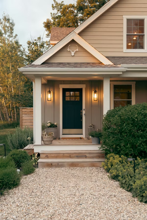
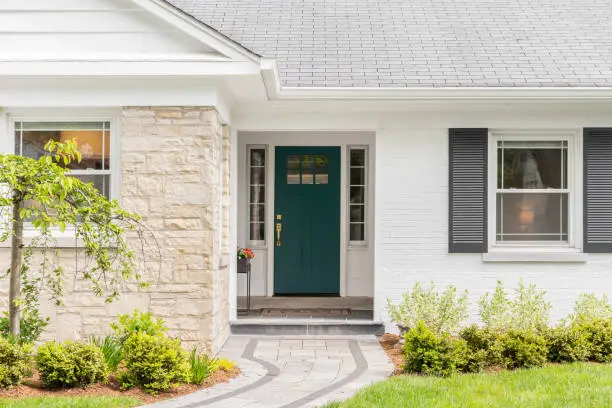
Practically, this means thinking about the path material. Gravel, stepping stones, brick pavers, poured concrete each communicates something different. Gravel is relaxed and informal, forgiving of irregular shapes, and sounds satisfying underfoot. Brick is warm and traditional, suggesting permanence and care.
Large-format stone pavers laid with deliberate spacing read as contemporary and considered. The worst option, aesthetically, is deteriorating concrete that was poured as a utilitarian necessity and never revisited. If that’s what you’re working with, even a gravel overlay or a row of stepping stones through it improves the experience of approaching the door.
Lighting along the path is equally important and equally neglected. Solar bollard lights or low-voltage stake lights placed at intervals along the approach do two things: they make the path navigable after dark, and they create an atmospheric arrival experience that no amount of daytime design can replicate. A lit path, warm and welcoming on a dark evening, is one of those details that guests register without being able to name what they registered.
The Door as the Central Argument
If the approach is the opening sentence, the front door is the thesis statement. It is the single most visible, most identifiable, most characterful element of the entrance, and it rewards investment, financial or otherwise more consistently than almost any other exterior element.
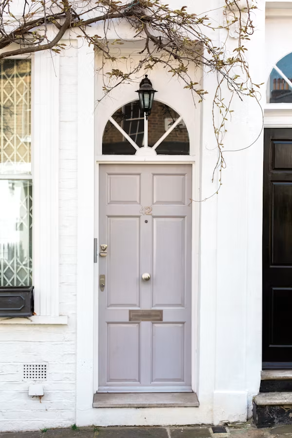
The colour of the front door is the decision with the highest impact-to-effort ratio in all of residential design. A door painted in a confident, deliberate colour transforms the entire facade. It creates a focal point, introduces personality, and signals immediately that the people inside this house have opinions and act on them.
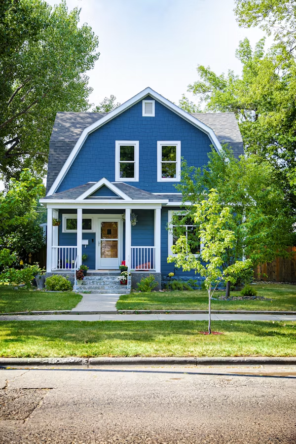
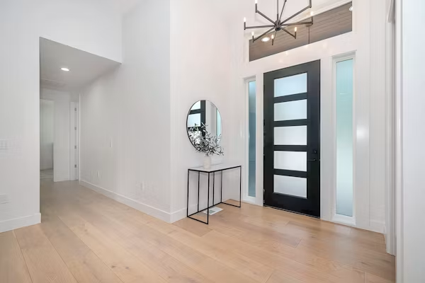
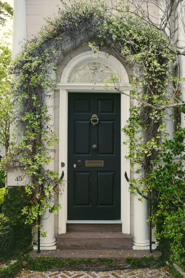
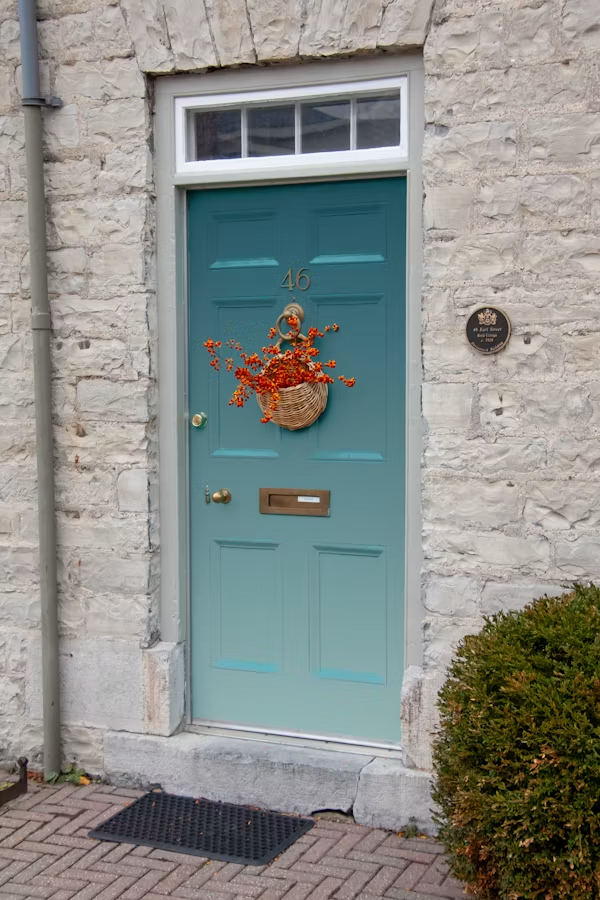
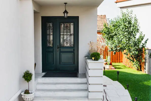
The classics endure for good reason: deep navy reads as sophisticated and serious; matte black is graphic and contemporary; a rich red is warm and historically rooted; forest green is grounded and quietly distinctive; a pale blue-green sits in the sweet spot between bold and approachable.
The colour doesn’t need to be unconventional to be effective. What it needs to be is chosen actively selected for this specific house, this specific facade, this specific desired impression rather than left at whatever shade it arrived in.
Beyond colour, the door’s hardware participates in the design conversation whether you engage with it or not. A worn brass knocker and a mismatched lever handle and a doorbell that might work tell one story. A cohesive set of hardware; knocker, handle, letterbox plate, house numbers in a unified finish tells another.
The investment required to tell the better story is modest. Matte black hardware suits contemporary and traditional styles alike. Unlacquered or aged brass has a warmth and quality that patinas beautifully over time. Polished nickel reads as clean and classic.
House numbers deserve more attention than they typically receive. The typeface, the size, the placement, the material, all of these either contribute to the entrance design or subtract from it. A set of individually mounted numerals in a font with genuine character, at a scale that commands attention, positioned thoughtfully on the facade, is one of those details that separates a house that looks designed from a house that looks inhabited. It is also, in terms of the actual logistics of ordering and installing it, a small afternoon project.
Planting That Frames Rather Than Fills
There is a planting approach to house entrances that confuses abundance with intention. The result is a facade lost behind overgrown hedging, a path bordered by miscellaneous shrubs that have merged into an undifferentiated mass, flowerbeds that bloom with everything and therefore communicate nothing. More plants is not better entrance planting. Better plants, better placed, is better entrance planting.
The most effective entrance planting frames the architecture rather than competing with it. A matching pair of clipped box balls or topiary standards flanking the front door creates a symmetry that reads as formal and welcoming in equal measure as it has been used since the Renaissance because it works, and it continues to work.
A single statement tree like a pleached hornbeam, a multi-stem birch or an olive in a generous pot positioned to one side of the path creates asymmetric interest and a sense of scale. Climbing plants trained against the facade such as roses, wisteria, clematis, or the more immediately gratifying evergreen options soften the boundary between architecture and landscape in a way that no other planting achieves.
The containers at the entrance are part of the design. A beautiful plant in a tired or scale-inappropriate pot is a half-finished thought. Large, confident planters in materials that suit the house such as stone, concrete, terracotta, lead-effect make the plants inside them look intentional. The scale rule is consistent: planters at the entrance should be larger than instinct suggests. Small pots at the entrance of a full-sized house look lost. Large pots look deliberate.
Seasonal interest is worth planning for. Entrances that look wonderful in summer and bleak from November through April are entrances that fail for a significant portion of the year. Evergreen structure like topiary, bay trees, box, yew provides a reliable backbone that holds the design together year-round. Seasonal colour can layer on top of it through bulbs, annuals, and flowering climbers without the whole scheme collapsing when autumn arrives.
The Overhead Element Nobody Thinks About
Look up at the entrance of most houses and there is either a standard porch light, a small canopy of questionable waterproofing, or nothing at all. This is a missed opportunity, because the overhead dimension of an entrance (what covers and frames the transition from outside to inside) is one of the most architecturally significant elements available.
A well-designed overhead structure, even a modest one, transforms the entrance from a flat facade feature into a genuine spatial experience. A simple canopy with clean lines provides shelter and defines the threshold without requiring planning permission or significant construction. A timber pergola over the path, even partially planted with a climbing rose or wisteria, creates the kind of arrival experience that stays with people and memory of walking under something beautiful before entering a home.
Even without structural additions, the entrance light fixture does overhead work that is worth taking seriously. It is visible from the street, it illuminates the facade, and it operates during the hours when atmospheric quality matters most.
A lantern in a classic form suits a period property and many contemporary ones. A more architectural pendant or a recessed spotlight suits a cleaner, more minimal facade. The fixture should be weather-rated, proportional to the door and the facade, and lit with a warm bulb that flatters everything it illuminates.
The Threshold: Where Inside Meets Outside
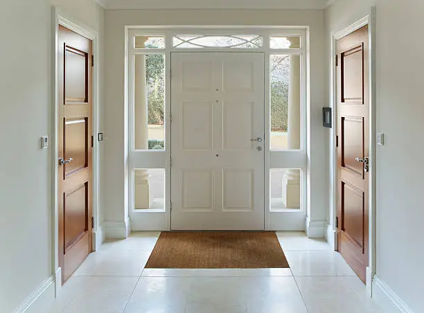
The doormat and the immediate area around the door occupy a peculiar design position: they are simultaneously indoor and outdoor, functional and decorative, the last thing you see leaving and the first thing visitors notice arriving. They deserve more consideration than they typically receive.
The doormat is doing more than catching dirt, though catching dirt is a genuine service. It signals to anyone approaching that the people inside this house have a sense of humour, or a sense of tradition, or a sense of design, whichever the mat expresses.
The standard “Welcome” mat in a font that suggests obligation rather than warmth is not the mat you want. There are better options at every price point, from natural coir mats with geometric patterns to colourful encaustic tile-effect designs to simple, oversized natural fibre mats that look effortlessly correct.
The boot scraper, where present, is a period detail that has an architectural dignity entirely out of proportion to its function. A simple iron scraper set into the step beside the door requires no maintenance, never needs replacing, and tells everyone who sees it that the entrance was designed by someone who knew what they were doing.
The step itself, if raised, is worth considering as a design element. A repainted or repaired step edge, a step riser in a contrasting tile or paint colour, or simply a well-maintained surface that doesn’t suggest structural anxiety, these are small things with consistent effect.
Coherence as the Final Principle
All of the individual elements discussed above; the path, the door, the hardware, the planting, the lighting, the overhead structure, the threshold only produce a genuinely impressive house entrance when they speak the same design language. Coherence is what separates an entrance that has been designed from one that has been accumulated.
This doesn’t mean everything needs to match in a literal sense. It means everything should belong to the same story. The rustic reclaimed wood door and the wildflower planting and the gravel path and the aged iron lantern all belong together. The sleek black door and the clipped topiary and the stone pavers and the architectural pendant all belong together. Neither of these is objectively better. Both are coherent, and coherence is what makes a design feel resolved rather than in progress.
The house entrance is where that resolution first appears. Get it right, and the whole house benefits because everything that follows is coloured by the impression formed in those first few seconds of arrival.
That impression is yours to craft. It starts at the gate, travels the path, lands at the door, and lives in the details you chose.