Stairs and Hallway Ideas: How to Design the Spine of Your Home With the Attention It Deserves
Most people decorate rooms. The best homes decorate the spaces between them.
There is a design category that sits in a curious blind spot for most homeowners. Not the living room, which gets the sofa budget and the gallery wall and the carefully sourced rug. Not the bedroom, which gets the linen duvet and the bedside lamps and the considered paint colour. Not even the kitchen, which in contemporary home design has practically become a competitive sport.
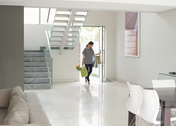
The blind spot is the staircase and hallway, the vertical and horizontal infrastructure of the home. The bones. The connective tissue between every room you’ve carefully decorated. The spaces that every member of the household moves through more times per day than any other, and that guests encounter the moment they step inside.
These spaces are treated, in most homes, as corridors in the most reductive sense of the word: functional passages from one destination to another, not destinations themselves. The result is a home that is beautifully appointed in its rooms and strangely anonymous in its arteries as though the house has a series of excellent destinations connected by an airport terminal.
The stairs and hallway deserve better. More to the point, they deserve to be understood as a single design system, a continuous spatial experience that flows from the front door through the hall, up the staircase, and into the upper landing. When that system is designed with the same intentionality as the individual rooms it connects, the whole house changes. Not just the corridor. The whole house.
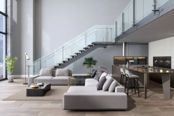
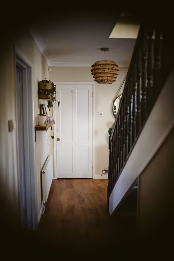
The Staircase as Architecture You Already Own
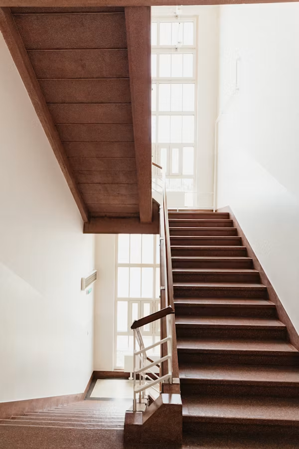
Most people live with their staircase as a fixed, immutable fact — something the house came with, like the boiler or the foundations. This is an understandable position and also a missed opportunity, because the staircase is one of the most architecturally significant features in a multi-storey home. It occupies vertical space in a way that nothing else does. It draws the eye upward. It creates sightlines from multiple levels simultaneously. And it is, in most houses, doing very little with all of that potential.
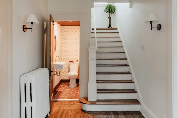
The staircase has several components that can be addressed independently or together: the treads, the risers, the balusters, the handrail, and the newel posts. Each of these is a design element as well as a structural one, and changing any of them changes the character of the staircase substantially.
The stair risers, the vertical faces between each tread, are the most commonly overlooked and the most immediately transformative element to address. Painted white by default in the majority of homes, they can instead be painted in a bold accent colour that creates a graphic rhythm as you ascend. They can be tiled in patterned encaustic cement tiles that introduce pattern and colour in a way that nothing else in the house achieves. They can be wallpapered yes, wallpapered, in a print that makes the staircase an event rather than a route. The effect in all cases is the same: a staircase that was infrastructure becomes architecture.
The handrail and balusters, in many period and mid-century homes, were either original to the house and tired, or replaced at some point with something generic. Both situations are recoverable. Replacing plain timber balusters with something more characterful; metal spindles in a decorative pattern, custom-turned timber designs, or the now widely available steel cable systems that open sightlines and feel contemporary in almost any setting, changes the silhouette of the staircase and by extension the feel of the entire hallway below it.
Painting the handrail in a deep, contrasting colour while keeping balusters white or light is a small intervention with a large visual impact. A handrail in matte black, deep navy, or a warm dark green against white balusters draws the eye upward along the staircase and creates a graphic clarity that architectural photographers tend to love for good reason.
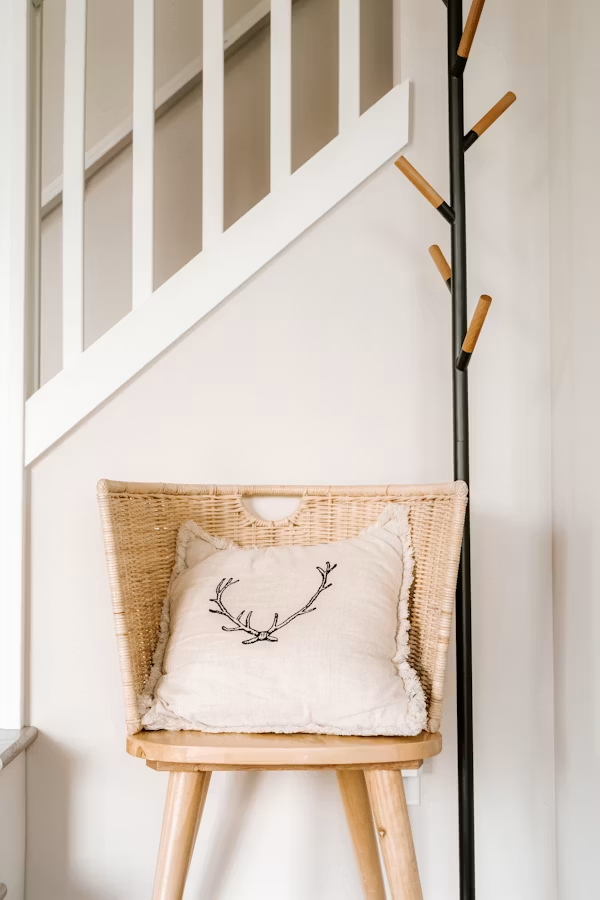
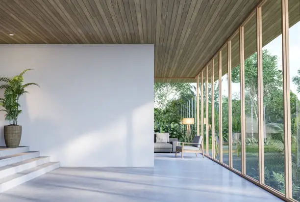
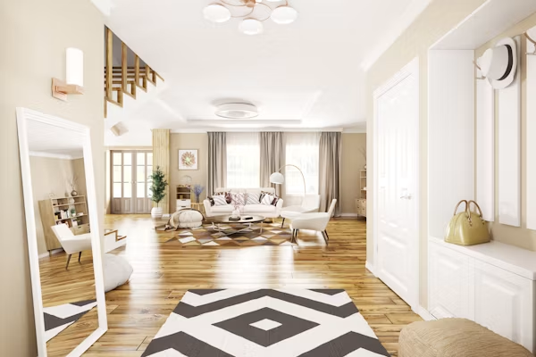
The Hallway Floor as the Continuous Thread
The floor of the hallway and staircase is the one element that runs uninterrupted through the entire spatial sequence from the front door across the hall, up the stairs, and across the landing. It is therefore the most powerful tool available for creating design coherence across this sequence, and it is the tool most frequently wasted.
Wall-to-wall carpet on stairs and landing in a standard cream or beige is the default in many homes, chosen for its practicality and its inoffensiveness. It is neither offensive nor interesting. It makes the staircase disappear, which is not what a staircase of any architectural merit should do.
A runner on a stained or painted staircase is the combination that produces the most consistently successful results. The stair treads painted or stained in a rich wood tone, the risers in a contrasting colour or pattern, and a runner in a Persian, kilim, or geometric pattern running up the center of the staircase: this layering of materials creates a warmth, depth, and visual interest that makes the staircase feel like a designed feature. The runner also solves the practical noise and slip concerns associated with bare-tread stairs, which means it is doing functional work at the same time as decorative work, always a good deal.
In the hallway itself, the floor conversation is closely tied to the proportion of the space. Long, narrow hallways benefit from a runner that emphasises their length rather than working against it, a bold stripe or geometric pattern that leads the eye toward its destination. Wider hallway spaces can accommodate a full rug, properly sized, that grounds a furniture arrangement and makes the hallway feel like a room. Whatever the choice, the floor material and the stair treatment should be in dialogue: not necessarily identical, but clearly from the same design conversation.
The Staircase Wall: The Most Dramatic Canvas in the House
The wall that rises alongside a staircase is, purely in terms of visual scale, one of the largest single surfaces in any home. It is also one of the most commonly left blank; a vast expanse of painted wall interrupted occasionally by a single framed photo hung at an awkward angle that pleases no one.
This wall is a gallery wall opportunity of unusual drama. Because it rises diagonally with the staircase, a well-executed arrangement of framed art, photographs, or prints can create a visual ascent that makes the journey up the stairs an experience. The key, and this is the key that most staircase gallery walls miss, is to treat the arrangement as a composition that works with the diagonal of the staircase rather than ignoring it.
The bottom of the arrangement should begin at roughly the height of the first stair; the top should reach the ceiling of the upper landing or close to it. The overall silhouette of the arrangement should follow the rise of the stairs, climbing with them.
Frame consistency matters even more on a staircase wall than in a standard gallery arrangement, because the scale of the wall means that any inconsistency is visible from a greater distance and reads as disorder rather than eclecticism. A unified frame styl; all black, all white, all matching wood tones with varied content inside creates a collection rather than a chaos. The content can be as personal or as curated as the homeowner prefers: family photography alongside art prints, a mix of vintage posters and children’s drawings, a consistent series of botanical illustrations. The frame is the architecture; the content is the personality.
Beyond the gallery approach, the staircase wall suits bold wallpaper in a way that almost no other surface in the house does. A dramatic large-scale botanical, an architectural toile, a deep geometric or any of these, applied to the staircase wall and continued across the upper landing ceiling if ambition permits, turns the ascent into a full sensory transition between floors. It is the most theatrical design move available in a domestic interior without any structural intervention, and it is achievable on a weekend.
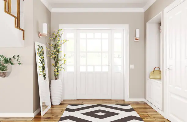
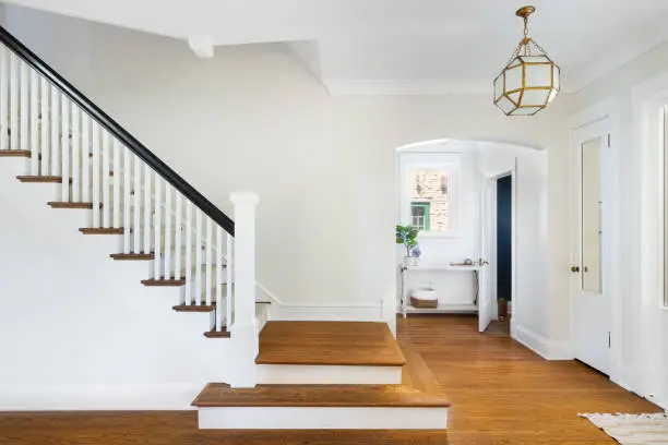
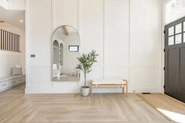
The Landing as a Room That Doesn’t Know It’s a Room
The upper landing sits at the top of the staircase and serves, in most homes, the same non-purpose as the lower hallway: a junction between rooms, lightly furnished if at all, decorated with whatever didn’t fit elsewhere. Like the lower hallway, it is used constantly and designed almost never.
But the landing has something the lower hallway often lacks: natural light. A window on the landing, a skylight above the stairwell, or borrowed light from upper bedroom doorways all give the landing a warmth and openness that the corridor below might not share. This light is a resource, and using it well begins with not blocking it, keeping furniture and decor choices at a scale that doesn’t impede the flow of light through the space.
A small sitting area on a generous landing; an armchair, a side table, a lamp creates a pause in the sequence of the home that is genuinely useful and pleasurably unexpected. A place to sit and read on the landing, between the upper rooms and the stair, is a domestic luxury that costs approximately one good armchair and repays it in the quality of daily experience. It makes the landing a destination rather than a junction.
Bookshelves on a landing wall, built-in or freestanding, address both the functional problem of storage and the atmospheric problem of empty walls simultaneously. Books are among the most effective decorative elements in residential design as they add texture, colour, and personality in a way that requires no curation beyond the collection itself.
A wall of books on a landing, well-lit from above or by a dedicated reading lamp, creates a small library moment that gives the upper floor of the house an intellectual warmth that individual rooms alone cannot provide.
Light, Again, Because It Always Comes Back to Light
The staircase and hallway have a specific lighting challenge that compounds the general challenge of any transitional space: they need to work safely in the dark. People navigate stairs in the middle of the night. They move through hallways at dawn without wanting to be blinded by overhead lighting. The safety dimension of staircase lighting is real and should be the first consideration, not the last.
But safety and atmosphere are not mutually exclusive. Step lights recessed into stair risers or mounted low on the staircase wall provide safe navigation lighting at night while creating a dramatic architectural effect that makes the staircase look extraordinary in photographs and in person.
A pendant hung in the stairwell, suspended on a long cable from the upper landing ceiling down through the stairwell space, fills the vertical volume of the staircase with a focal point that draws the eye upward and fills what is otherwise an empty architectural void.
The landing light fixture is the one that gets seen from the hallway below, from the landing itself, and from upper bedroom doorways simultaneously. It occupies a more prominent visual position than almost any other fixture in the house, and it deserves a choice that reflects that position.
A statement pendant, a sculptural chandelier scaled to the landing ceiling height, or a series of smaller pendants at varying heights that fill the landing ceiling plane, any of these turns the upper light source from a necessity into an event.
The Coherence That Ties It Together
The stairs and hallway, treated as a single design system from front door to upper landing, produce something that neither space achieves independently: a home that feels continuous. A home where the design intention doesn’t pause at the living room door and resume at the bedroom, but flows through the entire structure, including the spaces in between.
That continuity is what distinguishes a house that has been decorated from a home that has been designed. The rooms can be beautiful in isolation. The journey between them is what makes the whole thing cohere.
Design the journey. The destination is already waiting.

")


")