Understanding the Basics of Pattern Mixing
Pattern mixing is an art that requires a solid understanding of fundamental principles to achieve a polished and cohesive look. One of the essential concepts is scale, which refers to the size of the patterns being used. When mixing patterns, it is crucial to consider how larger patterns can dominate a design, while smaller patterns can serve as complementary accents. Balancing these scales can create an engaging visual dynamic that is appealing to the eye. For instance, pairing a bold, large-scale floral print with a subtle, smaller checkered pattern can result in an efficient pairing that highlights the strengths of both.
Color coordination plays a vital role in successful pattern mixing. A harmonious color palette can bring a diverse array of patterns together, ensuring that they do not compete for attention. When selecting patterns, it may be beneficial to establish a common color scheme that binds them together. For example, using shades of blue and green across various prints—such as stripes, florals, and geometric shapes—can create a unified and sophisticated appearance. It is advisable to choose colors that resonate well with each other, avoiding clashes that can detract from the overall aesthetic.
Furthermore, different types of patterns tend to interact with one another in unique ways. Geometric patterns, which are often more rigid in structure, can contrast beautifully with softer, more organic designs like florals. Stripes are extremely versatile and can serve as a bridge between more intricate patterns, adding structure to a mix. By understanding how different pattern styles work together, one can create a harmonious design that effectively showcases their creativity.
Through careful selection and consideration of scale, color, and the types of patterns involved, anyone can master the art of pattern mixing. Applying these fundamentals is key to achieving a sophisticated and visually appealing result.
Choosing the Right Patterns for Your Space
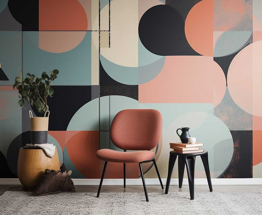
When it comes to selecting patterns for your living environment, the subtleties of design can significantly influence the overall ambiance of a room. A well-curated mix of patterns can enhance your space, while a haphazard approach may lead to visual disarray. To achieve a harmonious look, it is essential to consider the existing décor and the intended style of the room. Start by identifying the predominant design theme—whether it be modern, rustic, traditional, or eclectic. This understanding will guide your selections.
Next, compatibility with the existing color palette is crucial. Patterns should not clash but rather complement each other, creating a fluid visual experience. Opting for patterns that share a common color tone or hue can ensure cohesion throughout the space. For instance, a bold geometric print can work seamlessly with a softer floral design if they are harmonized through a shared color scheme. Additionally, employing similar shapes across patterns can create a sense of balance.
Texture and material play an equally important role in pattern selection. Incorporating a variety of textures can add depth to your décor. Mixing fabrics such as velvet, cotton, or linen with different patterns can lead to a sophisticated and layered appearance. Also, consider the scale of the patterns you choose—combining large prints with smaller ones can provide visual interest without overwhelming the senses.
To inspire your choices, take note of successful combinations around you or consult design resources that showcase interior spaces with impressive pattern coordination. By approaching the selection process thoughtfully—mindful of pattern, color, texture, and style—you can curate a space that feels both intentional and aesthetically pleasing.
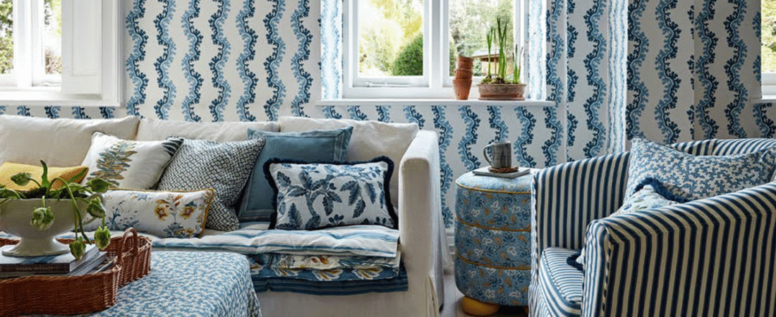
Textiles and Accessories: Practical Applications of Pattern Mixing
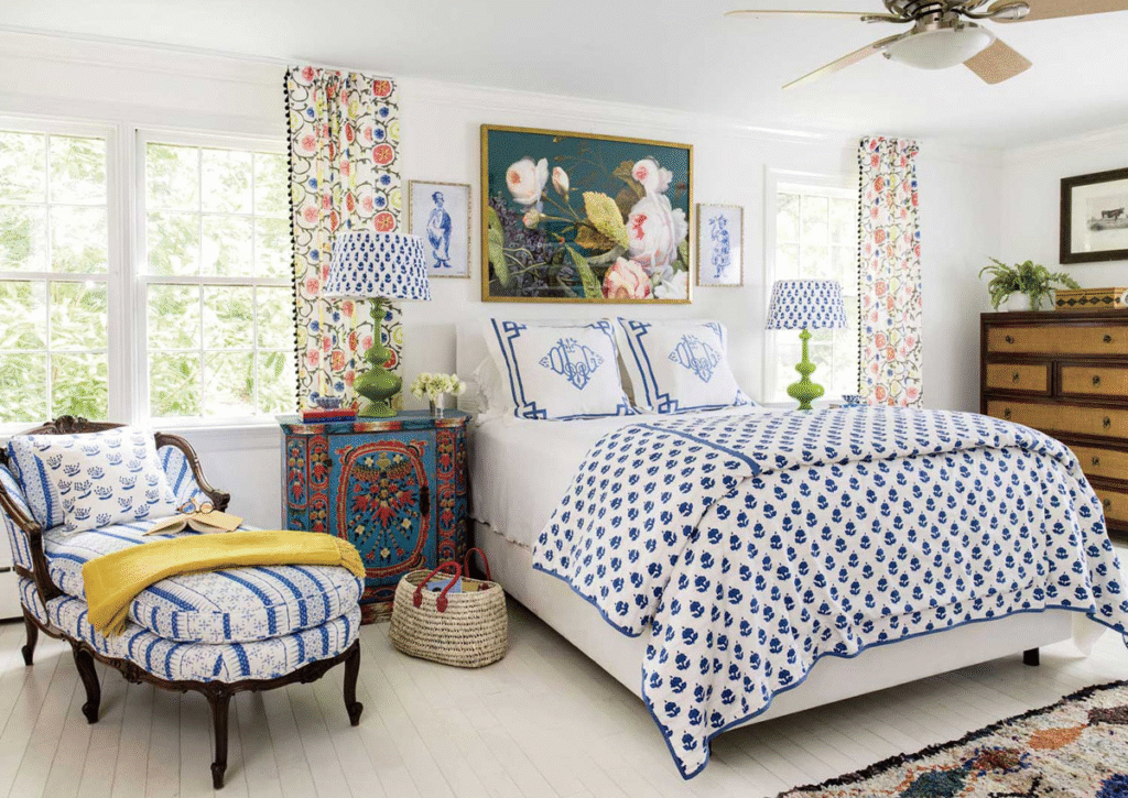
In the realm of interior design, the art of mixing and matching patterns is an essential skill that can elevate the aesthetic of any space. This technique is particularly effective when applied to textiles and accessories, allowing homeowners to create visually dynamic environments. When considering how to incorporate patterns into elements such as cushions, rugs, curtains, and wall art, it is vital to understand how different designs can complement each other.
For example, pairing geometric patterns with floral designs can create an interesting juxtaposition that adds character to a room. A well-designed room might include a striped rug beneath a couch adorned with floral cushions, creating a sophisticated yet playful ambiance. Additionally, some patterns naturally mesh well together due to their color palettes or themes. Striking a balance is key; consider using one bold pattern alongside two to three subtle ones to maintain visual harmony while avoiding overwhelming the space.
Curtains serve as another fantastic opportunity for pattern mixing. A printed fabric with a botanical motif can be beautifully harmonized with a striped or polka dot sofa. The trick is to choose colors that resonate across the patterns. For instance, if the botanical print contains shades of green and cream, pairing it with cushions featuring cream stripes will create a cohesive look.
Wall art is also a game-changer in the pattern mixing strategy. Artwork featuring abstract shapes can be complemented by patterned textiles in the same color family, tying the entire room together. It is also beneficial to include textures—velvet, linen, or cotton, to further the layered effect in textiles.
Ultimately, the possibilities for mixing patterns in textiles and accessories are limitless. By thoughtfully combining colors, themes, and styles, you can create inviting and stylish spaces that reflect your unique taste. Experimentation, within a defined framework, is often rewarded with stunning visual outcomes.
Common Mistakes and How to Avoid Them
Mixing and matching patterns can elevate the aesthetic appeal of a space, yet it is easy to fall into common pitfalls that detract from the overall design. One prevalent mistake is overwhelming a space with too many patterns. When several distinct patterns are combined without a cohesive strategy, the result can feel chaotic rather than harmonious. To avoid this, it is crucial to adopt a curated approach by selecting a primary pattern that serves as a foundation and then incorporating secondary patterns that complement it. This method ensures that the visual flow remains intact, keeping the design engaging yet balanced.
Another frequent error involves clashing colors. Unlike solid hues, patterns come with multiple colors that can easily conflict with one another if not thoughtfully chosen. To sidestep this issue, it is advisable to establish a color palette beforehand. By selecting a set of hues that work together, one can ensure that the patterns fit cohesively within the same visual language. Utilizing color swatches or digital design tools can assist in visualizing how selected patterns will interact while maintaining overall consistency.
Additionally, neglecting to maintain a sense of visual balance is a common oversight. Even if patterns are chosen thoughtfully, uneven distribution across the space can lead to dissatisfaction. A successful design requires careful placement; large patterns may need to be anchored in significant areas, whereas smaller patterns can fill in surrounding details. Employing features like negative space can also create breathing room, allowing each pattern to shine without overwhelming others. By following these strategies, individuals can effectively navigate common mistakes in pattern mixing and create a well-balanced, visually appealing environment.
This post may contain affiliate links, which means we may earn a small commission if you purchase through them—at no extra cost to you. Hopefully we can help you find something that helps you.