Introduction to Color Psychology
Color plays a pivotal role in home decor, serving not merely as an aesthetic choice but as a psychological tool that can significantly influence our moods and perceptions. Understanding color psychology allows homeowners and decorators alike to choose palettes that not only beautify spaces but also create the desired emotional responses. Each color conveys distinct meanings and elicits specific feelings, making the selection of a color palette a thoughtful process. For instance, warm hues like red and orange can stimulate energy and warmth, while cool tones such as blue and green evoke tranquility and serenity.
The ambiance of a room is cultivated through its palette—light shades can create an open, airy feel, while darker tones may instill a sense of coziness. Moreover, color has the ability to enhance spatial perceptions; a well-chosen color palette can make a small room feel larger or a large room feel more intimate. As individuals engage with their environments, the psychological effects of color become even more pronounced. Colors can affect our productivity, relaxation levels, and even appetite, demonstrating their powerful influence over our daily lives.
In the context of home decor, the careful consideration of color can transform not just the aesthetics of a space, but also how it feels to inhabit. As we delve into specific color palettes in this blog post, it’s essential to keep in mind how these selections might embody various emotional states and create atmospheres conducive to the activities and comforts we value at home. By harnessing the principles of color psychology, one can effectively curate spaces that resonate on deeper personal and emotional levels.
Choosing the Right Color Palette
Selecting a suitable color palette for your home is a crucial decision that can dramatically influence both the aesthetic and mood of your living space. The process begins with understanding the function of each room. For instance, a calm and serene palette may be ideal for a bedroom, while lively and energetic hues could be more appropriate for a playroom or entertainment area. Consider how you intend to use each space and what emotions you wish to evoke.
Another significant aspect to take into account is the size of the room. Lighter colors can create the illusion of spaciousness, making smaller rooms feel more expansive, while darker colors can add depth and warmth to larger areas. Additionally, natural and artificial lighting plays a pivotal role in color selection. Rooms with abundant sunlight may benefit from cooler tones, which can help regulate the temperature, whereas dimly lit spaces may look better with warmer shades that make them feel more inviting.
Your personal style also greatly impacts your color choices. It is essential to create a cohesive look that reflects your personality, whether that involves understated neutrals or bold, vibrant colors. Gather ideas from various sources, including nature, which offers a vast array of colors; art, which showcases different color combinations; and current decor trends that can provide modern inspirations. Online platforms like Pinterest and Instagram are excellent for visualizing what resonates with you. By compiling images and samples, you can distill your preferences into a coherent palette that aligns with your vision for a welcoming and harmonious home.
Palette 1: Timeless Neutrals
Timeless neutrals serve as a versatile foundation for any home design, characterized by a warm and inviting blend of beige, gray, and white hues. This color palette is often regarded as the quintessential choice for homeowners aiming to create a serene and sophisticated atmosphere. The calming effect of these shades not only enhances the aesthetic appeal but also provides a backdrop that allows various styles of furnishings and decor to shine.
One of the key advantages of utilizing neutral tones is their adaptability. In living rooms, for instance, walls painted in soft beige or warm gray can frame vibrant artwork or bold furniture selections, allowing these elements to become focal points without overwhelming the space. Similarly, in bedrooms, light and airy neutrals can invoke a sense of tranquility, creating a restful environment conducive to relaxation.
Moreover, the use of neutrals promotes balance in interior spaces. When combining different textures and materials, neutral shades anchor the design by minimizing visual distractions. For example, pairing a structured leather sofa with a plush beige area rug can create an engaging contrast while maintaining harmony throughout the room. This interplay of textures is vital in designing a cohesive aesthetic that feels both inviting and sophisticated.
Timeless neutral palettes are also beneficial for enhancing natural light within a room. Lighter shades of white or cream reflect sunlight, making spaces feel more open and airy. This quality is particularly advantageous in smaller areas or rooms with limited windows, where a brighter ambiance can significantly improve the feel of the space.
In conclusion, the timeless neutrality of beige, gray, and white not only creates a cozy and sophisticated atmosphere but also offers incredible flexibility and balance. Embracing this palette allows homeowners to achieve a timeless look while providing the ideal canvas for personal expression through decor.
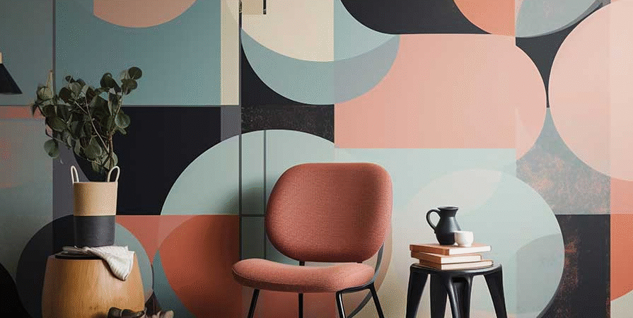
Palette 2: Bold Jewel Tones
Bold jewel tones, characterized by their rich and luxurious hues, have a remarkable ability to transform a living space into an oasis of sophistication and style. Colors such as emerald green, sapphire blue, and ruby red evoke a sense of opulence and grandeur, making them perfect candidates for those looking to create dramatic focal points in their home. When utilized thoughtfully, these striking shades can invigorate any room, drawing the eye and defining the atmosphere.
Incorporating jewel tones into your decor can be achieved in various ways. For instance, an emerald green velvet sofa can serve as a stunning centerpiece in a neutral living room. The deep color not only adds warmth but also acts as a versatile backdrop for other decorative elements. To enhance the elegance of these jewel tones, pairing them with gold or brass accents can be particularly effective. The warmth of gold and brass complements the cool undertones of sapphire blue and the vibrancy of ruby red, resulting in a harmonious balance that exudes luxury.
When layering jewel tones, consider using softer shades or metallics to prevent the colors from overwhelming the space. For example, accent pillows in lighter shades of cream or blush can soften the look, allowing bold colors to stand out without clashing. Offering an inviting and approachable aesthetic while maintaining a touch of drama, jewel tones can be integrated into various styles, from modern to classic.
Ultimately, the use of bold jewel tones in your home decor can achieve an extraordinary transformation, inviting luxury and elegance into everyday life. By thoughtfully selecting and layering these colors, one can create a vibrant yet harmonious ambiance that elevates the entire atmosphere of a room.
Related Posts:


Palette 3: Earthy Greens and Browns
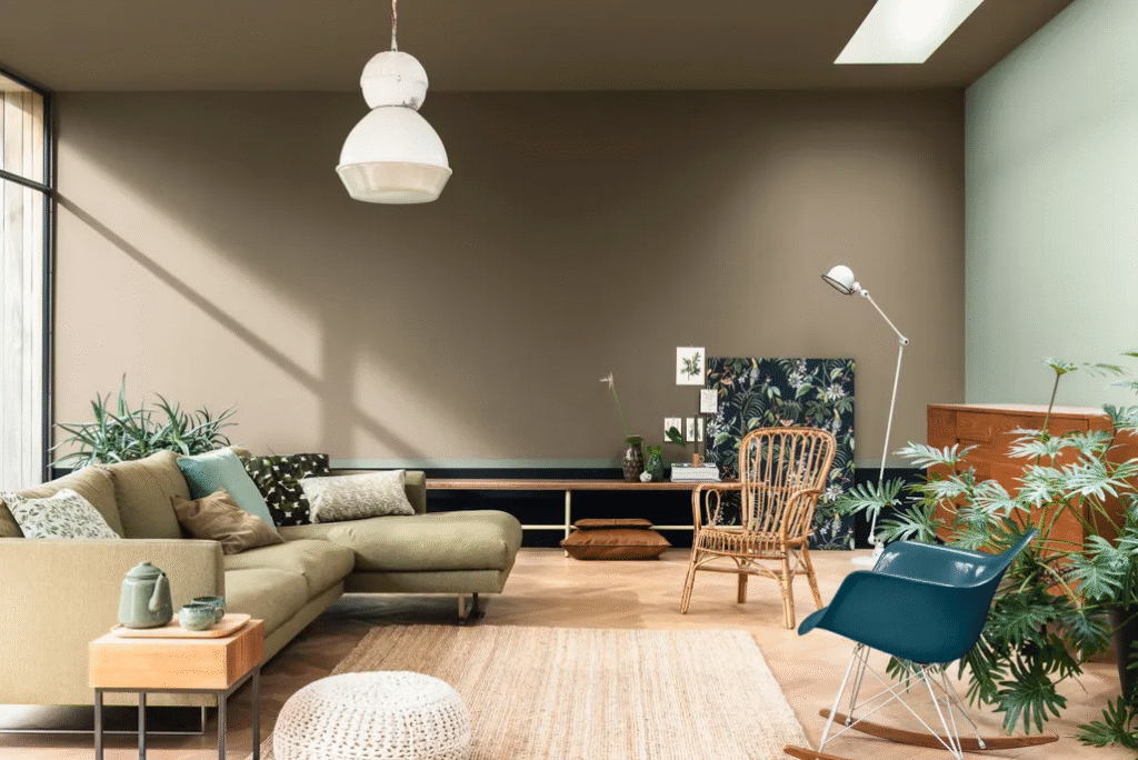
Earthy greens and browns create a soothing atmosphere that fosters a sense of tranquility in any living space. These colors are reminiscent of natural landscapes, evoking feelings of peace and harmony. The rich variety in shades of green—from soft sage to deeper forest hues—can transform a room into a refreshing escape, while warm browns, such as taupe and chestnut, add grounding elements that balance the overall palette.
Incorporating these earthy colors into your home can be achieved in several ways. For instance, painting walls in muted green tones creates a calming backdrop, particularly in bedrooms and living rooms where relaxation is paramount. Shades like olive or moss can also infuse a space with life, reminding occupants of serene outdoor settings. To harmonize these green hues, contrasting browns can be introduced through furniture, cabinetry, or accent pieces. Natural wood finishes, which embody organic textures, further enhance the room’s earthy vibe.
Textures play a crucial role in bringing the earthy palette to life. Consider using natural fibers such as jute, linen, or cotton for pillows, throws, and rugs, which add warmth and depth to the décor. A wooden coffee table or shelving units constructed from reclaimed timber contribute an eco-friendly touch while reinforcing the organic atmosphere. To complement these elements, incorporating plants not only enlivens the space but also enhances the tranquility associated with earthy tones, creating a serene sanctuary that reflects the beauty of nature.
Ultimately, the combination of earthy greens and browns within your home can lead to a refreshing and inviting environment. This palette invites residents and visitors alike to feel immersed in nature’s elegance, promoting relaxation and an overall sense of well-being.
Palette 4: Soft Pastels
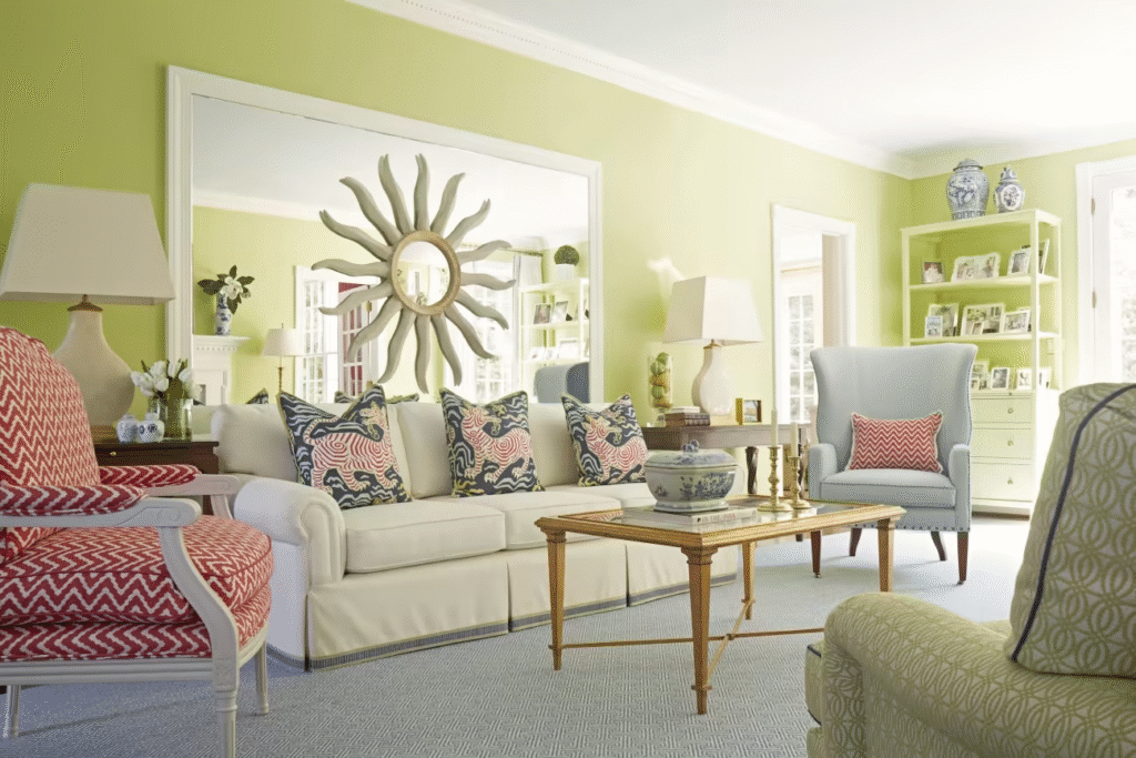
Soft pastels have become increasingly popular in interior design, celebrated for their ability to create a tranquil and inviting atmosphere. This color palette features muted shades, including blush pink, lavender, and baby blue, which are known for their calming effects, making them ideal choices for spaces such as bedrooms and nurseries. By incorporating these gentle tones into your decor, you can foster an environment that promotes relaxation and peace.
Blush pink is particularly versatile, pairing beautifully with both neutral and bold colors. It can be utilized on walls, bedding, or accent pieces like throw pillows and curtains to soften the overall look of a room. Lavender, with its delicate hue, enhances the serenity of a space. Consider using it as a focal accent wall or in plush furnishings, such as a comforting armchair or a cozy blanket draped over the bed. Baby blue adds a refreshing touch, reminiscent of clear skies, and works wonderfully in decor items, including vases or framed artwork, to enhance the lightness in a room.
To effectively utilize this soft pastel palette, consider layering different shades within the same color family. For example, combine various tones of pinks or blues in your decorative accents for a cohesive look. Additionally, incorporating natural textures, such as wooden elements or woven textiles, can offer contrast while maintaining a gentle aesthetic. Soft pastels can also be accented with metallics like gold or silver, introducing a touch of elegance without overwhelming the serene environment.
In summary, the soft pastel palette offers an exceptional way to transform your home into a serene haven. By thoughtfully incorporating these muted colors and complementing them with suitable decor elements, you can achieve a balanced and calming interior that invites comfort and relaxation.
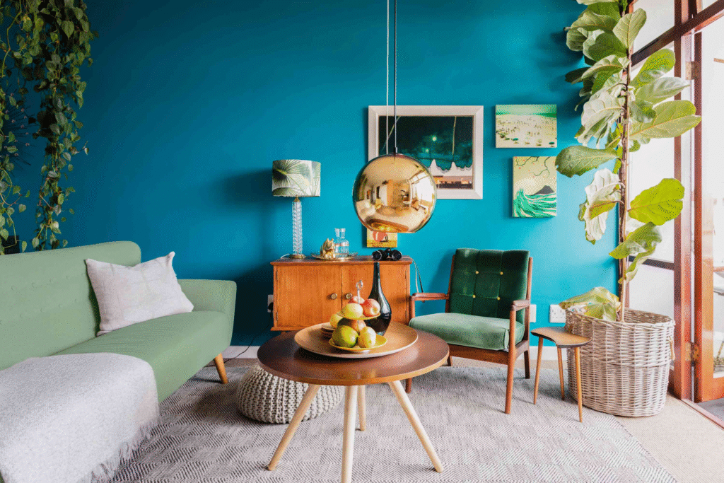
Palette 5: Vibrant Tropical Colors
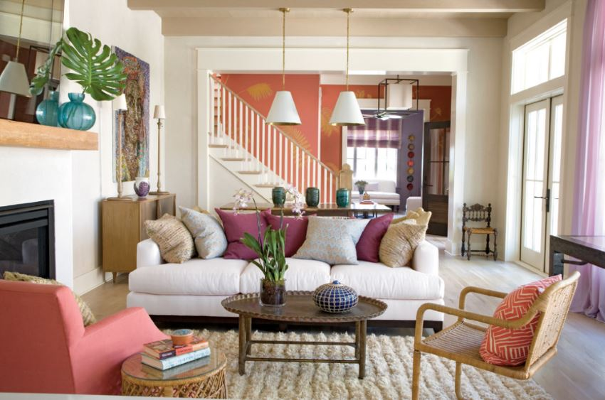
Vibrant tropical colors evoke a sense of energy and playfulness, transforming any home into a lively oasis. This palette typically features shades like coral, teal, and sunny yellow, which can revitalize both indoor and outdoor spaces. When strategically applied, these colors can create vibrant focal points that enliven your living environment, making it a true reflection of the tropical aesthetic.
Coral, with its warm blush undertones, serves as an excellent base or accent color. It pairs harmoniously with various neutral tones and can be introduced through furniture, artwork, or decor items. In living rooms, coral cushions or a bold statement wall can beautifully infuse warmth and personality. Additionally, when combined with natural materials like wood or rattan, this hue can replicate the warmth of tropical settings.
Teal, reminiscent of serene ocean waters, offers a refreshing contrast to the warmth of coral. It can be effectively used in any room, especially in kitchens and bathrooms, where it creates a calming atmosphere. For outdoor areas, teal patio furniture or accessories can harmoniously blend with the surroundings, promoting a tranquil yet vibrant outdoor experience. This color can also be complemented with natural elements, such as potted plants or flowers, enhancing the tropical vibe.
Sunny yellow is another quintessential tropical color that injects joy and brightness into a space. Ideal for kitchens, dining areas, or even a home office, this color can uplift moods and energize those who enter the room. Consider integrating sunny yellow through accents like curtains, dishes, or art pieces to draw attention and inspire a cheerful ambiance. The combination of these vibrant tropical colors can elevate your home, resulting in a lively, playful environment that feels both inviting and energizing.
Palette 6: Moody Dark Colors
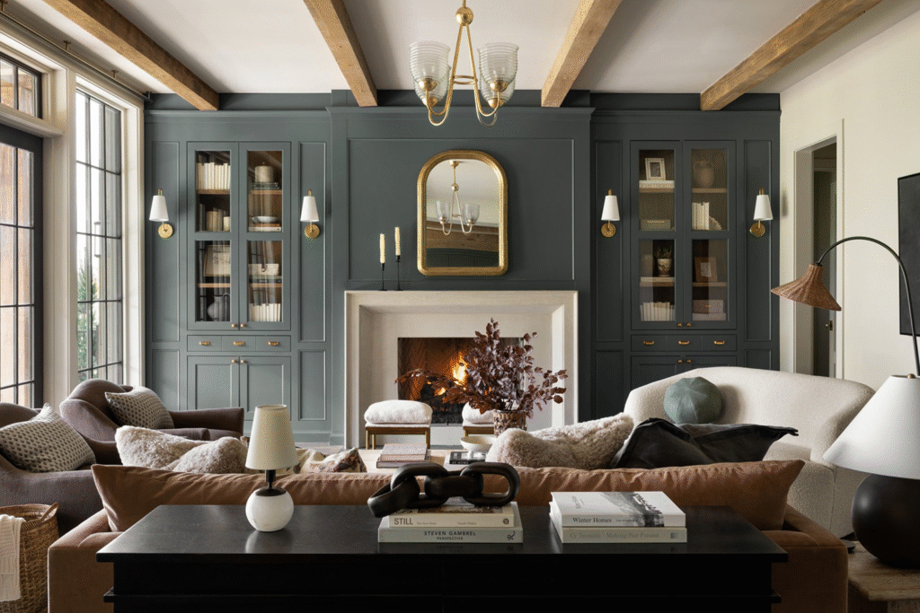
In the realm of interior design, the use of moody dark colors such as navy, charcoal, and deep burgundy can dramatically alter the atmosphere of any space. These hues are known for their ability to infuse a sense of intimacy and sophistication, creating environments that feel both cozy and luxurious. Incorporating dark colors into your home can evoke a feeling of depth, making rooms appear more atmospheric and inviting. However, this palette requires a thoughtful application to avoid a potentially oppressive ambiance.
When utilizing moody tones, it is essential to balance them with lighter elements or accents. For instance, pairing a deep navy wall with crisp white trim can create a striking contrast, drawing attention to architectural details while ensuring that the dark color does not overwhelm the space. Similarly, lighter furniture or decorative accents can break the monochromatic effect, providing visual relief and preventing the area from feeling constricted. Neutral hues, such as soft grays or warm beiges, can also serve as effective complements to enhance the overall harmony of the room.
Another approach is to layer different textures within the moody dark palette. Incorporating fabrics such as velvet or rich leather can add sophistication and warmth, while metallics can introduce a touch of glamour. Essential elements like artwork should also be considered; bold, colorful pieces can stand out against dark walls, providing focal points that draw the eye and enliven the atmosphere.
Emphasizing moody dark colors presents a remarkable opportunity to transform your home into a space that exudes elegance and comfort. By thoughtfully combining these deep shades with lighter complements and varied textures, you can achieve a balanced and inviting environment that truly reflects your personal style.
Palette 7: Monochromatic Schemes
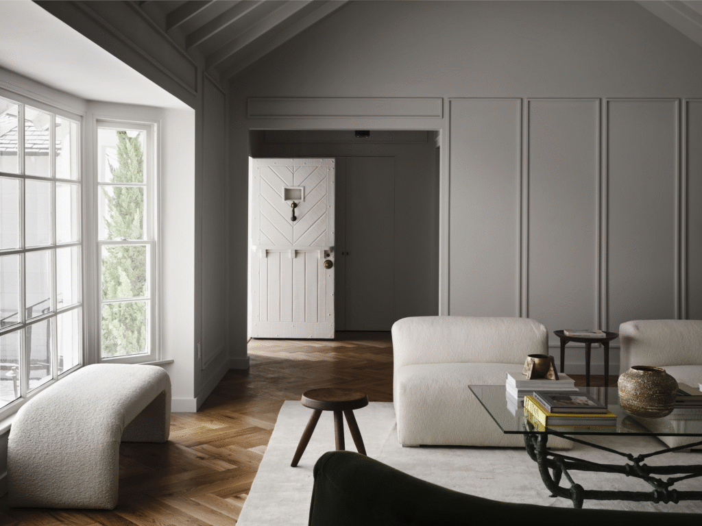
Monochromatic schemes offer a unique and sophisticated approach to interior design, utilizing variations in shades, tints, and tones of a single color. This method creates a cohesive and harmonious aesthetic that can elevate the overall atmosphere of a room. When properly implemented, monochromatic palettes can evoke a feeling of tranquility and sophistication, making them suitable for various spaces within a home.
To begin with, selecting a color that resonates with you is crucial. Consider the emotions and vibes associated with different colors; for instance, soft blues often invoke calmness and clarity, while vibrant reds can stimulate energy and excitement. Once a primary color is chosen, explore its lighter and darker shades—these variations will be essential in creating depth throughout the space.
In the living room, a monochromatic scheme can be executed effectively by incorporating various shades of the chosen color through furniture, textiles, and decor elements. For example, a palette of greens can feature a deep emerald sofa, paired with light moss green throw pillows and a pastel green area rug. This layering of colors ensures the space retains visual interest without losing cohesion.
In the bedroom, soothing tones can create a serene retreat. Using shades of grey, for instance, one might select charcoal bedding, complement it with slate grey curtains, and add soft grey accent walls. The effect is both elegant and calming, fostering an environment conducive to relaxation.
Ultimately, implementing a monochromatic scheme throughout your home can yield a chic and unified look. By carefully selecting a color and varying its shades, rooms can achieve a sense of sophistication while remaining inviting and comfortable. With its ability to draw the eye and showcase a designer’s flair, the monochromatic palette continues to be a favored choice among interior decorating enthusiasts.
Conclusion: Transforming Your Space Through Color
In the realm of interior design, the selection of a suitable color palette is paramount in influencing the overall ambiance of a home. The colors chosen not only reflect personal style but also have the power to shape mood and perception. By carefully considering and integrating the right colors, homeowners can create transformative spaces that resonate with comfort, energy, and aesthetics.
Each of the ten color palettes explored in this blog post offers unique possibilities, enabling homeowners to make astute design choices tailored to their preferences. From serene neutrals that create a sense of tranquility, to vibrant and bold hues that energize a room, the impact of color extends far beyond mere visual appeal. It can enhance the architectural features of a home, unify diverse design elements, and foster an inviting atmosphere.
Moreover, embracing color in decor choices is both an artistic expression and a strategic approach to home enhancement. Instead of shying away from boldness, readers are encouraged to experiment with colors that speak to them. Whether through accent walls, playful decor items, or thoughtfully chosen furnishings, the infusion of color can breathe new life into any space.
As you contemplate how to redesign or refresh your home, consider these color palettes not just as decorative choices, but as fundamental elements that can significantly alter the aesthetic and emotional landscape of your environment. We invite you to explore our curated selection of home decor products through the affiliate links provided. These carefully chosen items can assist you in achieving your desired look, ensuring that your home reflects not only your taste but also your unique personality.
This post may contain affiliate links, which means we may earn a small commission if you purchase through them—at no extra cost to you. Hopefully we can help you find something that helps you.