Small Hallway Ideas: How to Make the Narrowest Space in Your Home Feel Like It Was Planned That Way
A small hallway is not a design problem. It is a design brief. And a surprisingly good one.
There is a particular kind of frustration that small hallways inspire in people who care about their homes. You have spent real time and real money making the living room work, the bedroom feel considered, the kitchen look like something out of a design publication.
And then there’s the hallway that narrow, awkward, unavoidable strip of space that connects everything and yet refuses to cooperate with any of your design instincts. Too narrow for furniture. Too dim for art to show well. Too heavily trafficked for anything delicate. Too short to matter and too prominent to ignore.
Except it does matter. Considerably. The hallway is the space everyone moves through, every single day, multiple times. It is the first thing you see when you come home and the last thing you see when you leave. It connects rooms, transitions moods, and sets a cumulative tone for the entire home that is easy to underestimate until you’ve experienced the difference between a hallway that works and one that doesn’t.
The good news, and there is genuine good news here, is that small hallways respond to good design decisions faster and more visibly than almost any other space in a home. Because the square footage is modest, every choice has an immediate and measurable impact. There is nowhere for mediocre decisions to hide, which is challenging, but there is also nowhere for good decisions to go unnoticed. Get the small hallway right and it elevates the whole house.
Understand What the Space Is Actually Asking For
Before making any decisions about what to put in or on a small hallway, it is worth understanding the specific character of the problem. Small hallways fail for a relatively consistent set of reasons, and knowing which ones apply to your particular corridor points directly toward the solutions worth pursuing.
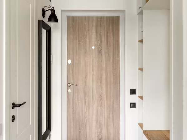
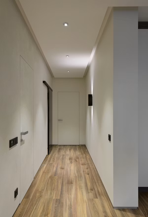
The most common issue is darkness. Hallways, particularly internal ones without windows or with only borrowed light from doorways, are among the gloomiest spaces in residential architecture. They were not, historically, designed to be dwelt in, they were designed to be passed through and their light provision reflects that utilitarian thinking. The result is a space that feels smaller than it is, because darkness compresses perceived volume, and less welcoming than it should be, because dim spaces read as neglected.
The second issue is proportional confusion. A narrow hallway with a high ceiling creates a vertical exaggeration that feels slightly vertiginous. A narrow hallway with a low ceiling feels oppressive. Standard ceiling height in a narrow corridor feels merely tight. Each of these proportional situations asks for a slightly different design response, and conflating them produces solutions that don’t fit the specific problem.
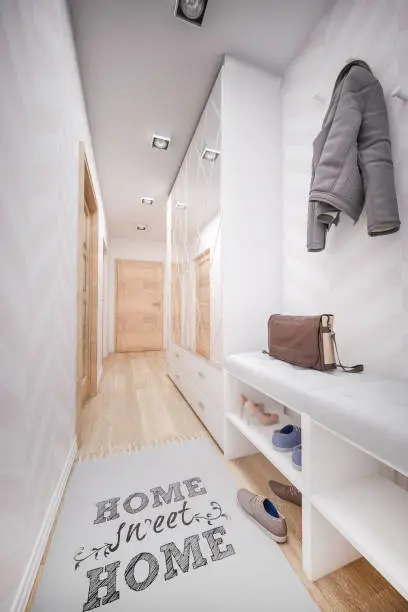
The third issue is clutter, the gravitational pull of the hallway toward functional chaos. Shoes, coats, bags, umbrellas, and the general debris of daily life accumulate here because the hallway is the transition point between outside and inside. Without deliberate storage design, the functional reality overwhelms whatever decorative intentions were ever in place. A beautifully styled narrow hallway with seven pairs of shoes on the floor is not a beautifully styled narrow hallway.
Identify which of these darkness, proportion, or clutter is the primary obstacle in your specific hallway. Usually it is more than one, and often it is all three. But there is typically a hierarchy, and addressing the most dominant problem first produces the fastest visible improvement.
Light Is the First and Most Important Intervention
In a small hallway, light does more structural work than any piece of furniture or decorative element. It alters the perceived size of the space, the warmth of the atmosphere, and the success of every other design decision made within it. Paint colours look different. Art reads differently. The overall experience shifts. Getting the lighting right is not the finishing touch in a small hallway, it is the foundation.
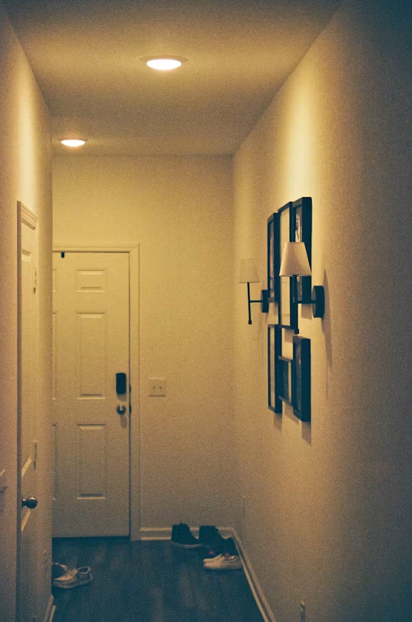
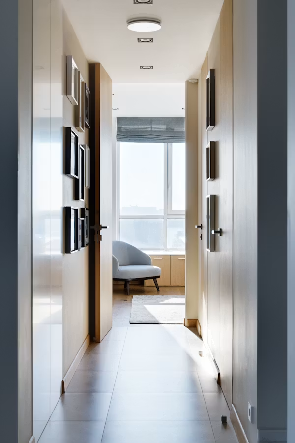
The overhead fitting, in most small hallways, is doing the work alone and doing it badly. A single central ceiling light produces a flat, even illumination that flattens the space rather than modulating it. Replacing it with a fitting that has genuine character, a small pendant lantern, a flush mount with an interesting silhouette, a semi-flush fixture that directs light upward as well as down addresses the atmosphere problem while maintaining the coverage.
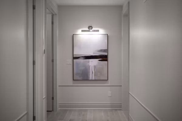
More transformative than the overhead fixture, though, is the introduction of supplementary light sources at lower levels. Wall sconces on either side of a mirror or piece of art bring light down to a height that is flattering to the space and to the people moving through it.
A small table lamp on a console, if the hallway is wide enough to accommodate one, introduces a warm pool of light that makes the corridor feel inhabited rather than institutional. Even a small plug-in sconce, hardwiring not required, changes the quality of the hallway’s atmosphere in a way that is immediately noticeable.
The bulb temperature matters perhaps more in a small hallway than anywhere else. The temptation, in a dark space, is to reach for the brightest, coolest-white bulb available on the theory that more lumens equals more light. What cool-white light actually produces in a small, enclosed corridor is clinical brightness without warmth, a space that is technically well-lit and experientially unpleasant.
Warm white at 2700K or lower, with enough sources to distribute the light rather than concentrate it, is the correct answer. It makes the space feel larger, not smaller, because warmth reads as openness to the human eye in a way that cool brightness does not.
The Mirror: Non-Negotiable and Worth Saying Twice
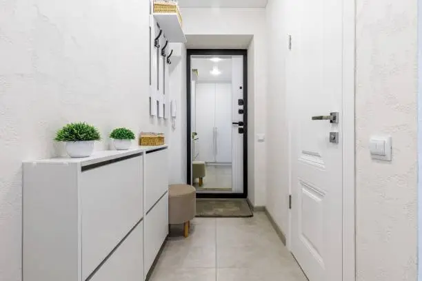
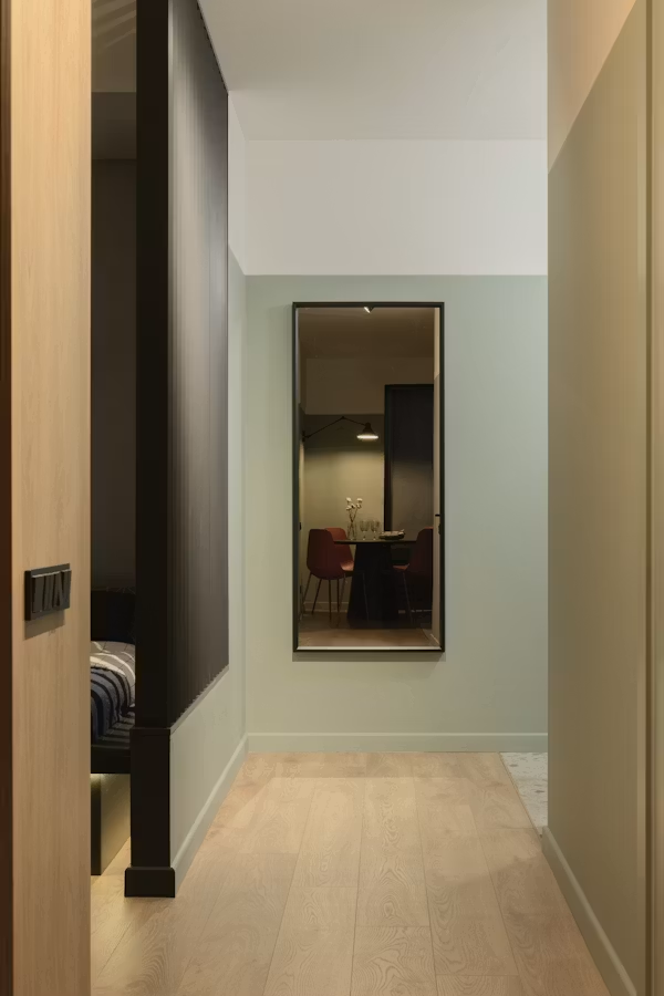
If there is a single design element that consistently does the most good in the smallest hallways, it is a large mirror. This has been said so many times in so many design contexts that it risks sounding like received wisdom rather than actual advice but it is actual advice, with a specific mechanism behind it.
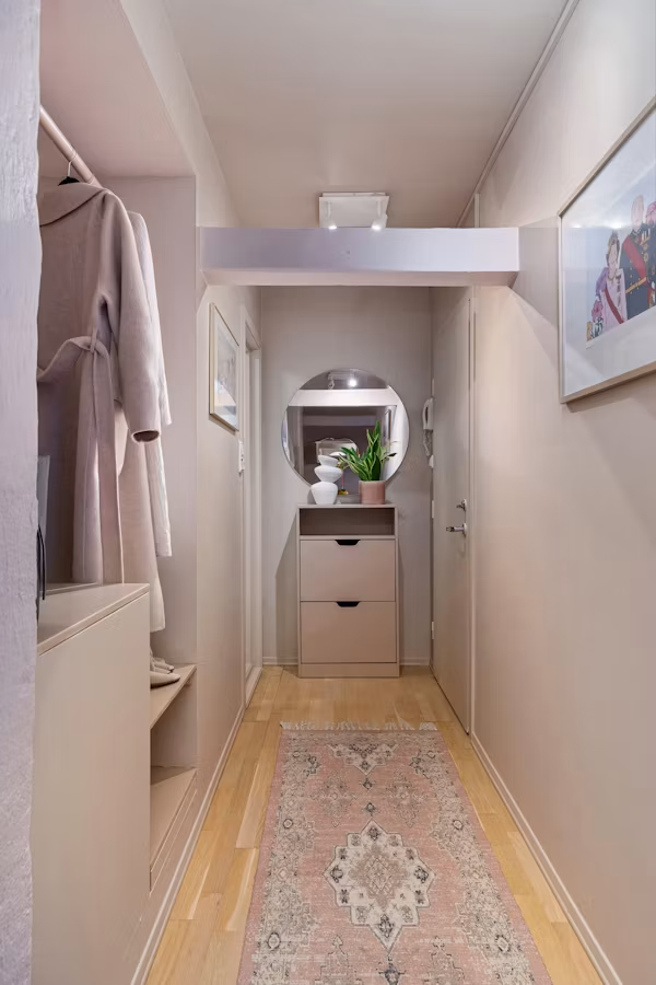
A mirror reflects the light sources in the hallway back into the space, effectively doubling the available light without adding a single watt. It creates a visual depth in the wall plane that extends the perceived dimension of the corridor, making it read as longer or wider depending on placement. And it serves the practical function of the hallway mirror, the last-look before leaving, that no amount of art or sconces can replicate.
The sizing principle is the one most commonly violated: go larger than instinct. A small mirror in a small hallway looks like a small mirror in a small hallway. A large mirror, one that commands the wall rather than occupying a portion of it, looks like a design decision. The wall above a console table is the classic placement. A full-length mirror leaned against the end wall of a narrow corridor, if the geometry allows it, creates a depth effect that borders on architectural illusion.
The frame contributes to the decorative language of the space. An arched mirror introduces a softness and contemporary grace. A gilded or antiqued frame adds warmth and a sense of history. A frameless mirror suits a more minimal scheme and disappears into the wall in a way that maximises the perceived space effect. Whatever the choice, the mirror should feel chosen, deliberately selected for this specific hallway rather than relocated from a bathroom remodel.
Storage That Earns Its Presence
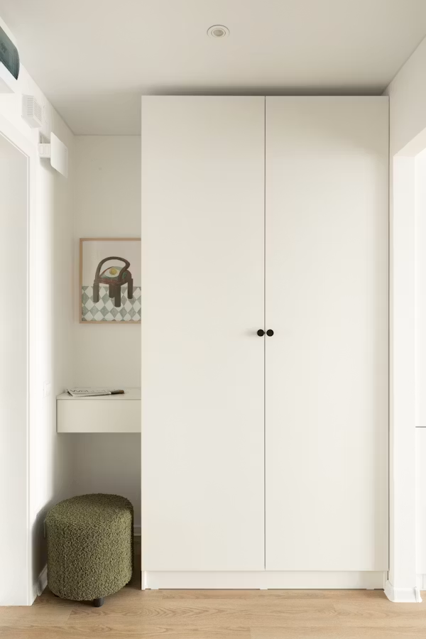
In a small hallway, the storage problem is real and deserves a real solution rather than a cosmetic one. Hiding the functional clutter of daily life behind attractive surfaces is not a compromise, it is good design practice. The question is which storage solutions work within the constraints of a narrow space.
A slim console table with drawers is the most versatile option, providing a surface at standing height and enclosed storage for the small objects that resist all other organizational efforts. The depth matters critically: a console that projects too far into the corridor narrows the passageway in a way that feels immediately uncomfortable. Fifteen to twenty-five centimetres of depth is typically the workable range in a genuinely narrow hallway.
Wall-mounted solutions liberate floor space entirely and are often the correct choice when the hallway is too narrow for any freestanding furniture. A row of hooks at coat height, in a hardware finish that coordinates with other metallic elements in the space, handles the outerwear problem without adding visual bulk at floor level.
A wall-mounted shelf above the hooks provides a surface for keys, mail, and the small objects that need a landing zone. A narrow floating shelf at standing height, with a small rail or lip at the front, does the same work as a console table without the footprint.
Shoe storage is the most consistently underserved need in hallway design and the most consistent source of visual chaos when ignored. A bench with internal storage, a wall-mounted shoe cabinet with flat-front doors, or a low cabinet that doubles as a seat while concealing footwear inside all address the problem without requiring significant floor area. In the narrowest hallways, a wall-mounted pull-down shoe rack that stores each pair vertically is a space engineering solution that earns its slightly utilitarian character.
Colour as the Secret Lever
The instinct in a small, dark hallway is to paint it white and hope for the best. White does help with light reflection, which is genuinely useful. But white also has a tendency, in enclosed corridors without natural light, to look grey and slightly dingy rather than bright and airy. It is a solution that addresses one problem while introducing another.
The bolder move and the one that produces more interesting results is to lean into the enclosed quality of the small hallway rather than fighting it. A deep, rich paint colour in a small corridor creates an enveloping, jewel-box effect that reads as intentional and atmospheric rather than cramped.
Dark teal, deep olive, warm terracotta, midnight navy, or a dark, complex green: any of these, applied to all four walls and the ceiling in a small hallway, create a sense of dramatic cohesion that transforms the experience of moving through the space. The corridor stops being a gap between rooms and becomes a room itself, brief but fully realised.
This approach works best when paired with strong lighting, which provides the contrast that makes the dark colour sing rather than sag, and a large mirror, which introduces the depth and light reflection that prevents the space from feeling oppressive.
The Detail That Finishes It
A small hallway designed with care; the right light, the right mirror, the right storage, the right colour becomes a space that people notice and comment on without necessarily knowing why. The why is that it was treated as a real room rather than a transitional non-space, and that respect for the square footage, however modest, is something the eye detects and responds to.
The final details; a runner rug in a pattern that leads the eye down the corridor, a piece of art that makes the wall feel considered, a plant that adds life to a space that might otherwise feel purely architectural are what move the hallway from designed to inhabited. From a project that was completed to a space that is lived in.
That distinction is where home design ultimately lives. Not in the grand gestures, but in the accumulated quality of small decisions made with attention.
Your hallway is small. That was never the problem. The problem was only ever inattention, and that is entirely fixable.