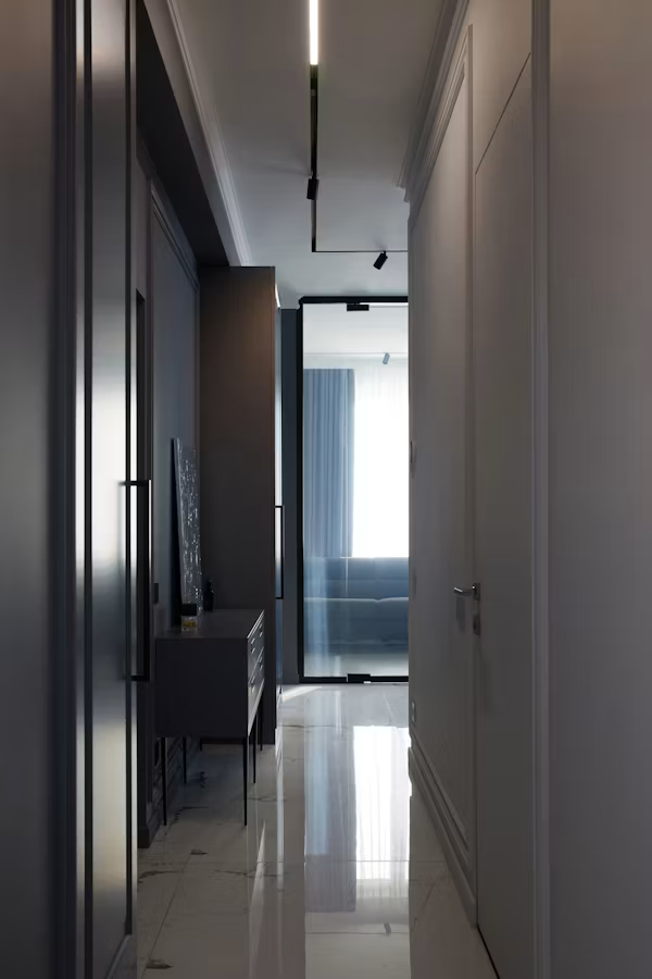
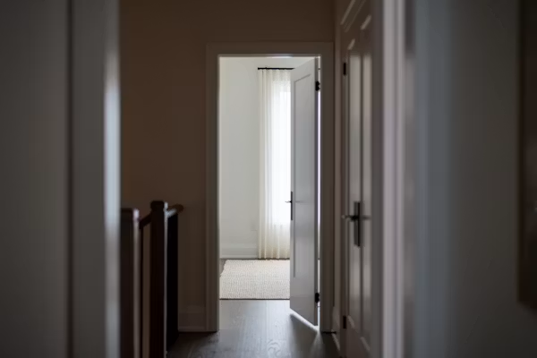
Hallway Wall Decor: How to Transform the Most Ignored Walls in Your Home
The hallway wall has been staring at you, blank and patient, for years. It is time to do something about that.
Of all the walls in a home, the hallway wall is the one most consistently treated as a non-entity. Living room walls get art. Bedroom walls get headboards and gallery arrangements. Kitchen walls get open shelving or a tile backsplash that someone spent three weekends selecting.
And the hallway wall? The hallway wall gets a coat of magnolia emulsion and absolutely nothing else, because you keep meaning to do something with it and then the moment passes and another year goes by.
This is a curious oversight when you consider that the hallway wall is, statistically, one of the most-viewed surfaces in your home. You pass it multiple times a day. Every guest who visits sees it. It is the visual companion of every transition between the outside world and the inside one, and between the different rooms of the house itself. It is, in other words, doing a great deal of work as a backdrop, the question is just whether that backdrop is working for you or against you.
Getting hallway wall decor right is one of the highest-leverage design decisions available to a homeowner or renter. The hallway is often narrow, limiting the furniture options that might otherwise carry a design scheme. The wall, therefore, is where the action is. Here is how to think about it properly.
Why the Hallway Wall Is Harder Than It Looks
Before diving into what to put on the hallway wall, it is worth understanding why so many hallway walls remain bare for so long. It is not purely negligence. The hallway presents a set of genuine design challenges that other rooms don’t.
The proportions are unusual. Most hallways are significantly taller than they are wide, and significantly longer than they are in any other dimension. Hanging art or decor that would look perfectly scaled in a bedroom or living room often looks marooned on a tall, narrow hallway wall, not wrong, exactly, but somehow not resolved. The scale relationship between the art and the wall is different here, and it requires different thinking.
The light is often poor. Hallways, particularly internal ones without windows, are among the darkest spaces in a home. Art that looks vibrant in a well-lit gallery or living room can look flat and muddy in a dim corridor. Whatever goes on the hallway wall needs to account for this, either by choosing pieces that hold up in low light or by improving the lighting before decorating, or both.
The wall is broken up. Light switches, doors, radiators, and the architectural intrusions of junction boxes and cable runs make the hallway wall more fragmented than walls in other rooms. Working with those interruptions, rather than treating the wall as a blank canvas that it isn’t, is what separates a hallway that looks designed from one that looks like an afterthought.
None of these challenges are insurmountable. They just require being acknowledged rather than ignored.
The Gallery Wall, Done With Actual Intention
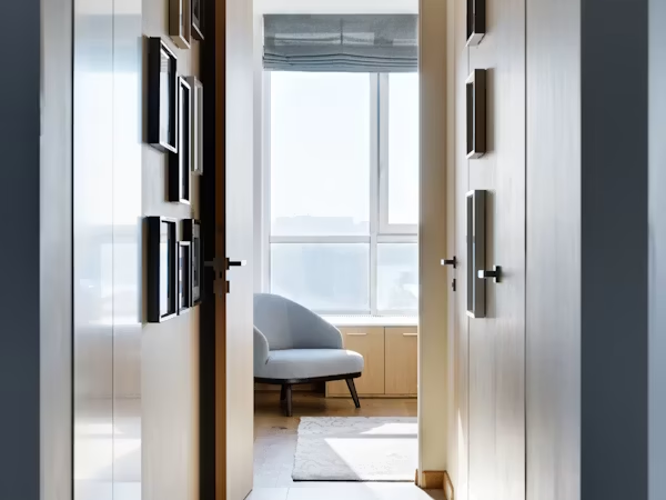
The gallery wall is, at this point, so ubiquitous in interior design conversations that it risks feeling like a cliché. It is not a cliché. It is a solution to a specific design problem; how to fill a large wall surface with multiple pieces without producing a random accumulation of frames and it is particularly well-suited to hallways.
The reason is that a gallery wall creates a continuous experience that rewards passing through a space, rather than demanding that you stop and look. You register it as you move, and it rewards that peripheral, kinetic engagement.
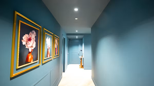
The difference between a gallery wall that looks intentional and one that looks like a collection of things that didn’t fit elsewhere comes down to a few consistent principles. Coherence of framing is the most important: matching or coordinated frames create visual unity even when the contents are wildly varied. A grid of identical black frames containing prints, photographs, and illustrations reads as a gallery. The same contents in seven different frame styles and sizes reads as a clear-out.
The second principle is committing to a layout before making holes in the wall. The classic approach; arranging all the frames on the floor first, adjusting until the composition feels right, then transferring the layout to the wall using paper templates has been described so many times in home design publications that it is practically cultural heritage at this point. It is described so often because it works, and because the alternative (putting holes in the wall and hoping it comes together) does not.
In a hallway specifically, gallery walls work best when they run consistently at a height that suits the movement through the space. Eye-level in a hallway is slightly different from eye-level in a room where you are seated as everything should hang a little higher, adjusted for the standing orientation of anyone passing through.
The instinct in a narrow hallway is to use small art, on the theory that large pieces will overwhelm a confined space. This instinct is reliably wrong. Small art on a large wall creates a visual vacuum; the art looks lost, the wall looks enormous, and the whole thing draws attention to the fact that something isn’t working rather than away from it.
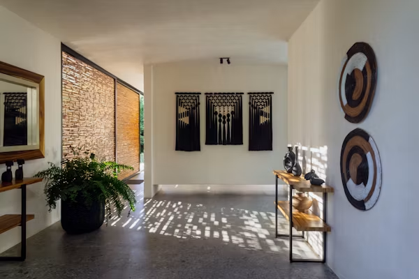
A single large-scale artwork, or a pair of substantial pieces hung at the same level, fills the wall with confidence and makes the hallway feel purposeful. The painting or print doesn’t need to be expensive to achieve this.
A large format print from an art print supplier, a canvas from a student exhibition, a vintage poster in an oversized frame so any of these can produce the kind of bold, confident wall treatment that transforms the experience of moving through a narrow corridor.
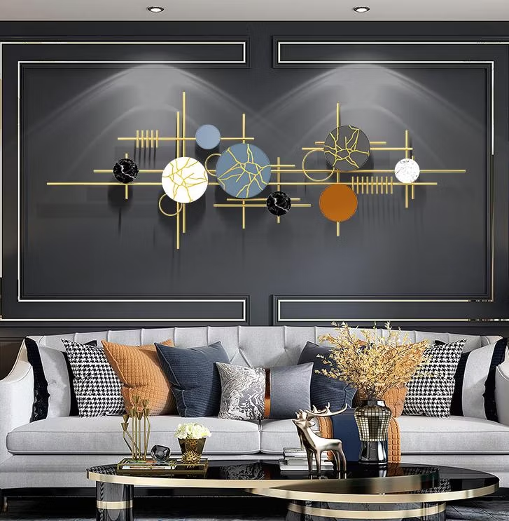
Abstract art performs particularly well in hallways. Its ambiguity doesn’t demand the sustained attention that figurative work does, which suits the transitional, kinetic nature of the space. A large abstract canvas in warm neutrals or deep, moody colours on a hallway wall reads as sophisticated and complete in a way that a collection of small prints rarely achieves in the same location.
The Mirror as the Underrated Workhorse
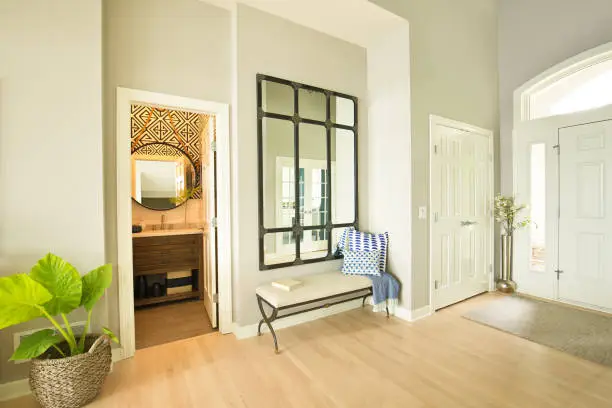
If you are going to put one thing on a hallway wall and only one thing, a large mirror is almost certainly the correct answer. It does more work per square inch than any other wall element available. It bounces light, making a dark hallway significantly brighter without any changes to the lighting infrastructure.
It creates the optical illusion of additional space and depth, making a narrow corridor feel less claustrophobic. It provides a practical function, checking your appearance before leaving, that no amount of art can replicate. And it looks expensive even when it isn’t.
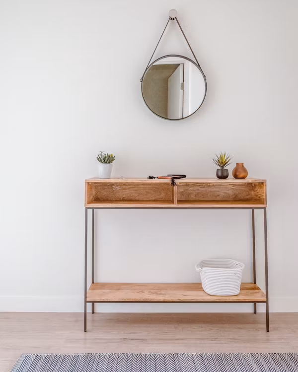
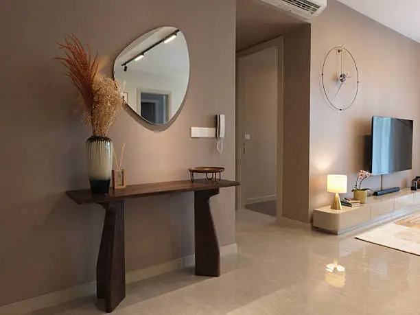
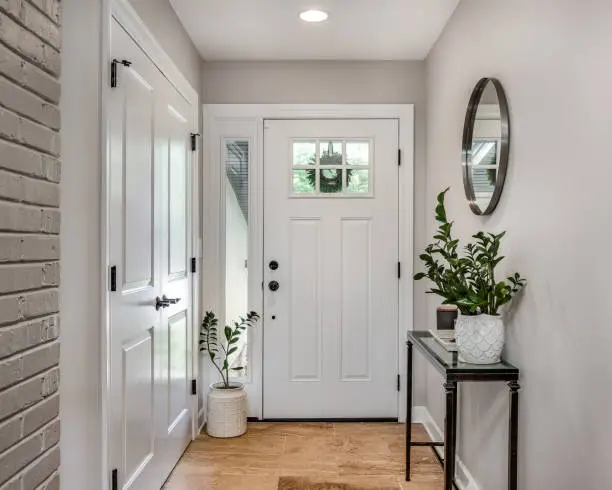
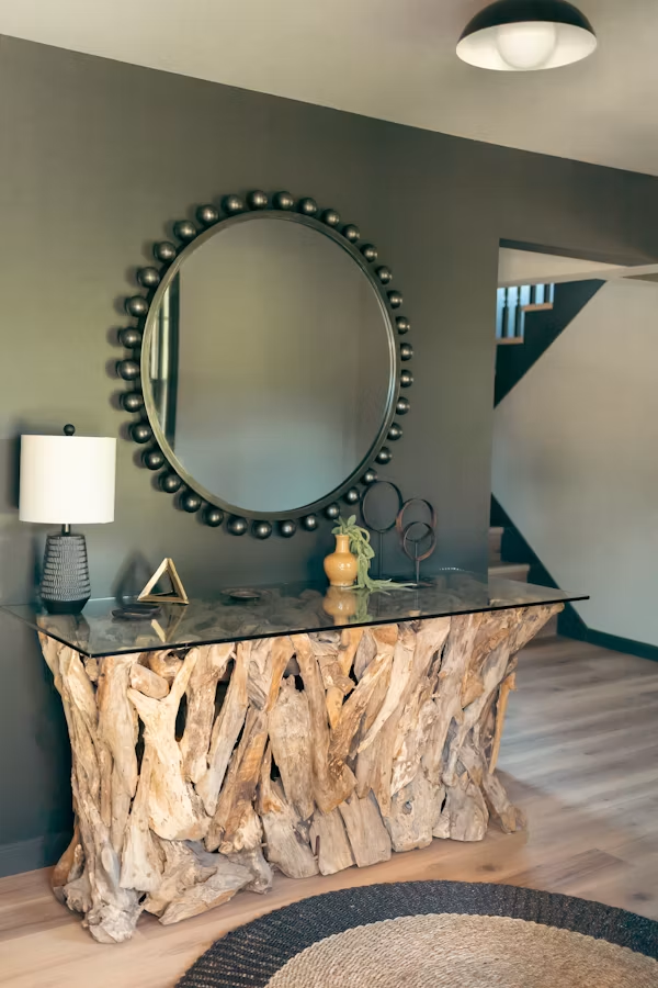
The shape of the mirror matters. An arched mirror reads as graceful and contemporary, with a soft top profile that suits both traditional and modern interiors. A full-length leaner mirror propped against the wall rather than hung creates a more casual, layered feel that works well in eclectic or maximalist schemes. A round mirror introduces a shape that contrasts with the rectangular angularity of most hallways and creates a focal point that functions almost like a piece of art.
The frame is the design decision. A frame in a statement finish like aged brass, matte black, deep walnut, ornate gilded plaster elevates a mirror from a functional object to a decorative one. The frame should coordinate with other hardware and metallic elements in the space: the light fixture, the door handles, any hooks or coat rack.
For maximum effect, a mirror hung opposite a window at the end of the hallway doubles the natural light from that window, illuminating the corridor in a way that feels almost architectural. This is a trick used in both residential and hotel design so consistently that it has ceased to be a trick and become simply good practice.
Wall Sconces and the Lighting-Decor Crossover
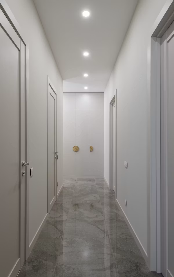
Hallway lighting is frequently an afterthought, which is why it so consistently produces an afterthought result. The standard ceiling fitting, mounted centrally in the corridor and fitted with a bulb that manages to be both harsh and dim simultaneously, is the default solution in most homes and the wrong one in almost all of them.
Wall sconces occupy a design territory that is simultaneously lighting and decor, and in the hallway they resolve both problems at once. Mounted at intervals along the wall like flanking a mirror, bracketing a piece of art, or simply spaced at regular intervals down a long corridor sconces provide warm, directional light at a level that is flattering to the space and to the people moving through it. They also provide visual rhythm, which is the element most lacking in long, undifferentiated hallways.
The style of sconce participates in the design language of the space. A pair of simple plaster-finish sconces reads as contemporary and architectural. Classic lantern-style sconces suit period properties and create a warmth that references traditional craftsmanship.
An unlacquered brass design adds a material richness that catches the eye and ages gracefully. Whatever the choice, the sconce as a wall element even when unlit contributes to the decorative treatment of the wall in a way that a ceiling light never can.
Texture, Panelling, and the Walls Themselves
Not all hallway wall decor is hung on the wall. Some of the most effective treatments work with the wall surface itself so treating the wall as the decorative element rather than as a canvas for other elements.
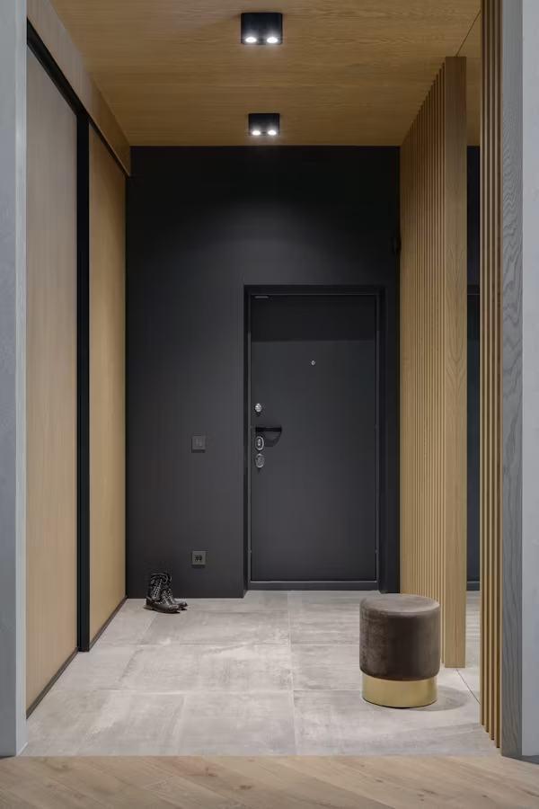
Wall panelling such as dado rails, picture rails, board-and-batten strips, or full shaker-style panelling adds architectural interest to a flat wall and creates a framework that makes subsequent decorating decisions easier.
A hallway wall with panelling below the dado rail, painted in a deeper tone than the wall above it, immediately reads as more resolved and architecturally rich than a flat painted surface. It gives the eye something to engage with without requiring art, mirrors, or any hanging elements whatsoever.
Wallpaper in a hallway is a design decision with an outsized impact relative to the area involved. Because hallway walls are typically a modest square footage, even an expensive wallpaper is a manageable investment.
And a dramatic wallpaper like a botanical print, a geometric pattern, a deep-coloured stripe, an architectural trompe l’oeil transforms the hallway from a transitional space into an experience. Guests notice it. You notice it every day. The willingness to be bold with wallpaper in a small, transitional space is one of the most reliable markers of genuine design confidence.
The Coherence Principle, Again
As with every other element of home design, the hallway wall achieves its best result not through the brilliance of any individual choice but through the coherence of all the choices together. The art, the mirror, the sconces, the paint colour, the panelling, these should speak the same design language as each other and as the rooms they connect.
A hallway that transitions between a contemporary kitchen and a traditional sitting room has the particular challenge of bridging two aesthetic worlds. The wall decor can either lean clearly in one direction or embrace the transitional nature of the space with a more eclectic approach that references both. What it cannot do, without producing confusion, is ignore the design context of the rooms on either side entirely.
The hallway wall, ultimately, is not a problem to solve or a surface to fill. It is an opportunity to establish and sustain the character of a home across the spaces that link it together like the connective tissue between rooms, done well.
It has been waiting for you to take it seriously. Now is as good a time as any.